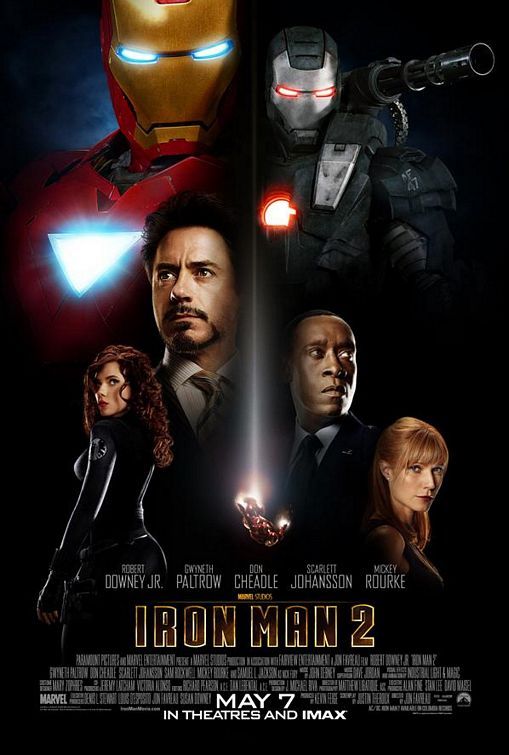
Moving right along, the next film poster in the MCU is Iron Man 2, released in 2010. What strikes me most about this poster is the evolution of Pepper’s character, who was objectified very blatantly in the first movie’s poster, but is pushed to the side in comparison to Black Widow’s character.
- Licensed Withdrawal
- Pepper is given a more serious, masculine face: she is looking right at the camera to assert some sort of dominance. Perhaps her portrayal in the first Iron Man film has given her a sense of power and approval by the men around her (fan-favoritism). Black Widow however, is portrayed looking over her shoulder at something behind her, so that she is unaware of the viewer.
- Ritualization of Subordination
- Natasha’s character is the person most blatantly objectified/sexualized in the poster. She is the only person in the poster whose full body is presented, specifically positioned/angled to show both her chest and her backside.
- Relative Size
- Both male characters are larger than the female characters, and are lower down within the poster than Tony Stark and Rhodey.
- Modern Shift
- Tony and Rhodey’s characters are shown with licensed withdrawal: they are not looking at the camera. This way, the poster viewer can look at both of their characters.
This poster was interesting to me because it proves itself both slightly better and slightly worse than the poster for the previous Iron Man movie. Pepper is less sexualized than she was before, but Black Widow is arguably more sexualized than Pepper ever was. Both women are also positioned smaller and lower than the men on the poster, suggesting that they play a lesser role in the film than the men.
Shared by: Grace Knudsen
Image Credit: https://www.imdb.com/title/tt1228705/